The New York Times
Reimagining the “For You” feature for a new audience

I read the news. Every day.
That may not be unusual for a middle-aged professional, but it is unusual among my fellow college students. The New York Times and other reputable news sources overwhelmingly target readers who are older, wealthier, and have longer attention spans than most of my peers.
I set out to design a feature for the New York Times that would allow people in their teens and twenties to be better informed about the world.
Young people want to be informed about world events, but they can’t do that well because…
Going into this, my original hypothesis was: If the New York Times had more content relevant to young people, they would be more engaged with the app and more informed on current events.
I designed a qualitative user study to test my hypothesis and uncover the barriers to entry for young people reading the news.
I interviewed five participants ranging in age from 21 to 63 with varying levels of familiarity with the New York Times app. Some were dedicated users, and others didn't consume news of any kind.
In short, young people want to be informed.
In my research, none of the young people were disinterested in current events. They all wanted to be informed, but for various reasons, their primary news source was social media.
My hypothesis had been partially disproven. Young people want to be well-informed about current events, but because of the constraints of time and mental health, they often don’t choose to read the news.
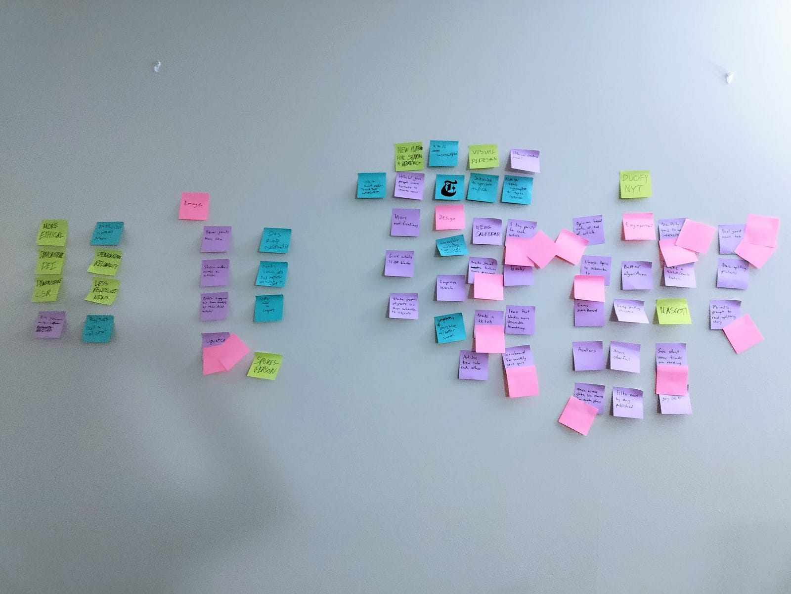
I recruited two friends as brainstorming buddies. Over the course of several hours, we worked through many possible solutions. We settled on two opportunity areas:
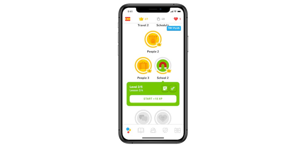
Two products became my models for engagement: Duolingo and TikTok.
Duolingo is the reigning king of gamification. The app utilizes strategic push notifications, rewards for consistent use, and lots of confetti to incentivize users to return to the app daily.
I considered implementing “streaks” in the NYTimes to reward users checking the news daily, but the idea wasn’t received well during testing. Users thought it would be too easy to cheat, which would bypass the goal of increased engagement.
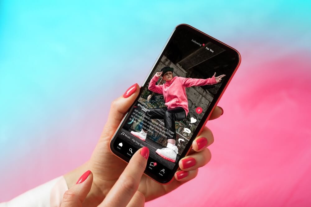
Tiktok is a controversial platform, but it’s a masterclass in engaging users through personalized, short-form content. It has an excellent algorithm which serves users an endless stream of short video snippets catering to their interests.
The NYTimes has a For You feature, but it falls short compared to Tiktok’s famous For You Page.
I decided to rework the For You feature to include the best parts of Tiktok.
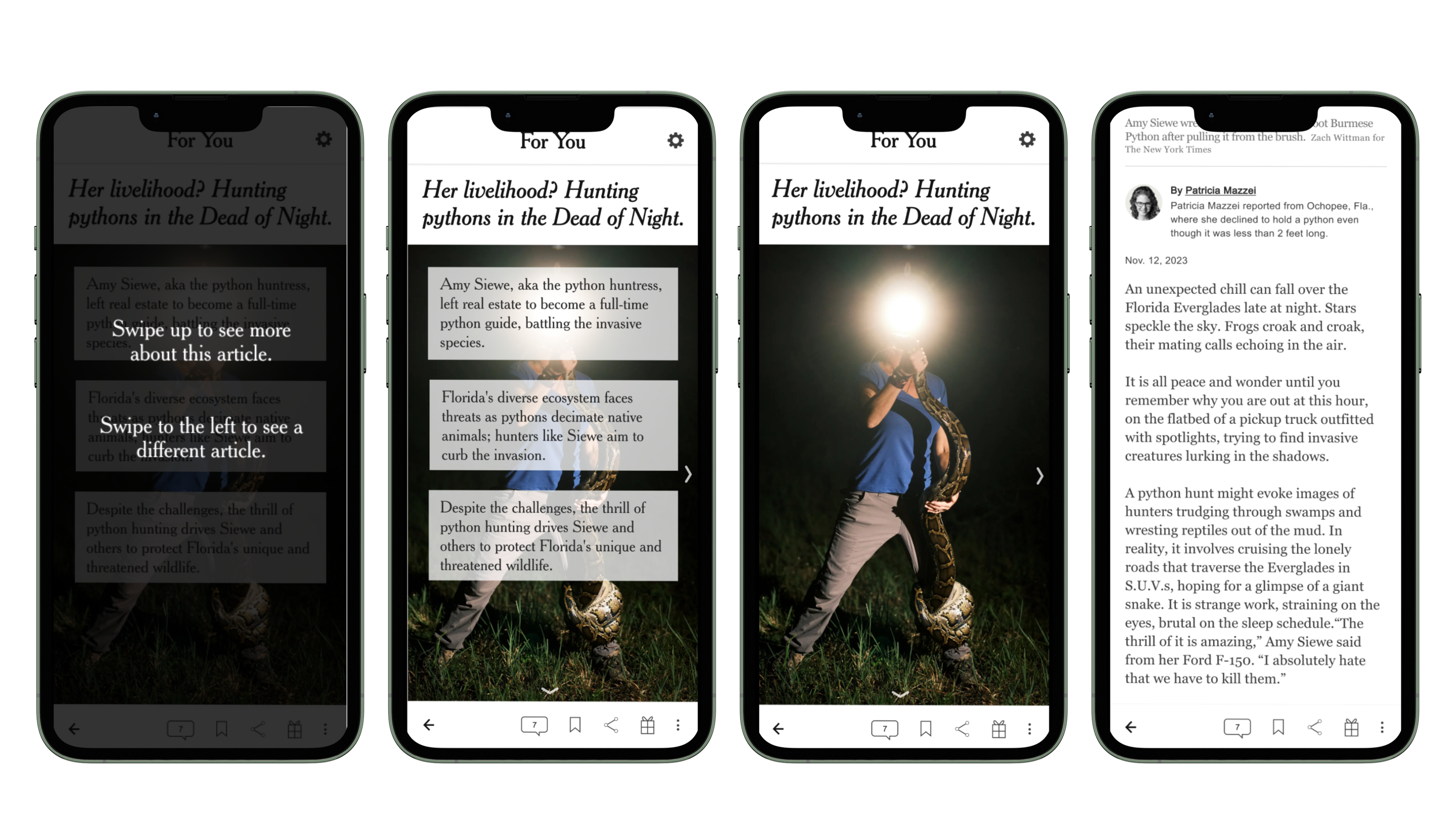
When I began designing, my primary objective was to capture the relaxed, flowing experience of scrolling through social media. I wanted the design to lean heavily on gesture navigation, but I didn't want to alienate the New York Times' less tech-savvy audience. To prevent this, I included a gesture education splash screen to briefly explain the navigation.
I also wrestled with the implementation of personalized content. Algorithm-suggested content feeds can be incredibly effective, but bad algorithms are a frustrating experience. Algorithms also come with data and privacy concerns that could undermine the values of the New York Times.
I decided to implement subscription-based personalization instead. Users could subscribe to topics of interest, and those topics would appear in their For You page, along with popular content from across the platform.
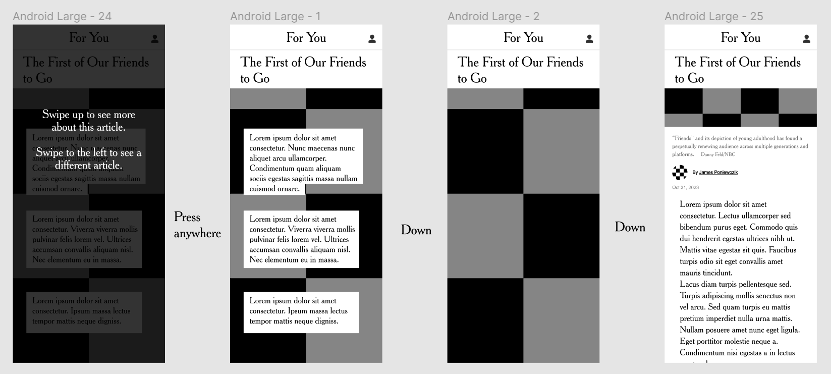
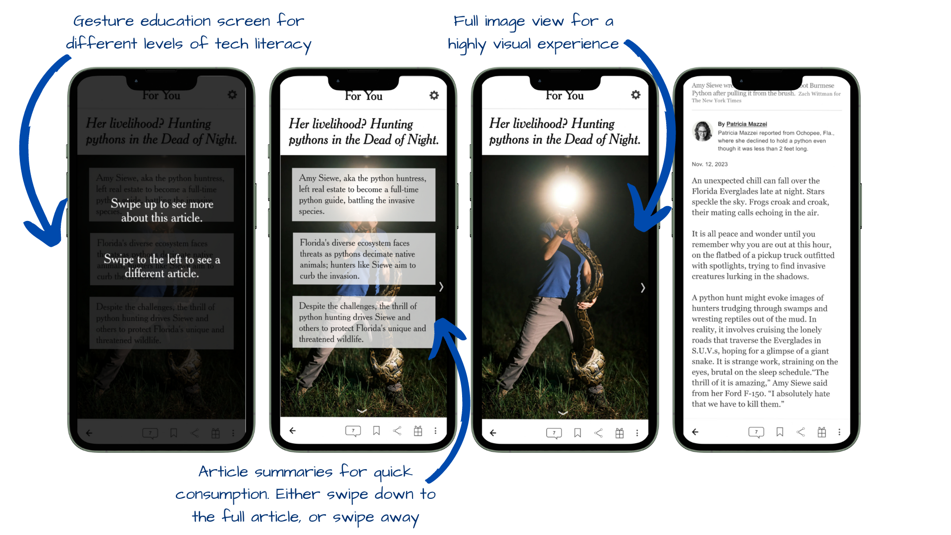
During the usability testing phase, I worked in Useberry to observe user walkthroughs, see heatmap data of user interactions, and collect qualitative survey responses from five participants.
Results:
Thanks for stopping by! Let's connect 👋
CONTACT ME 📩
rachelgellman02@gmail.com