Ithaca College Health Tracker
Comprehensive pandemic health tracking for the college campus
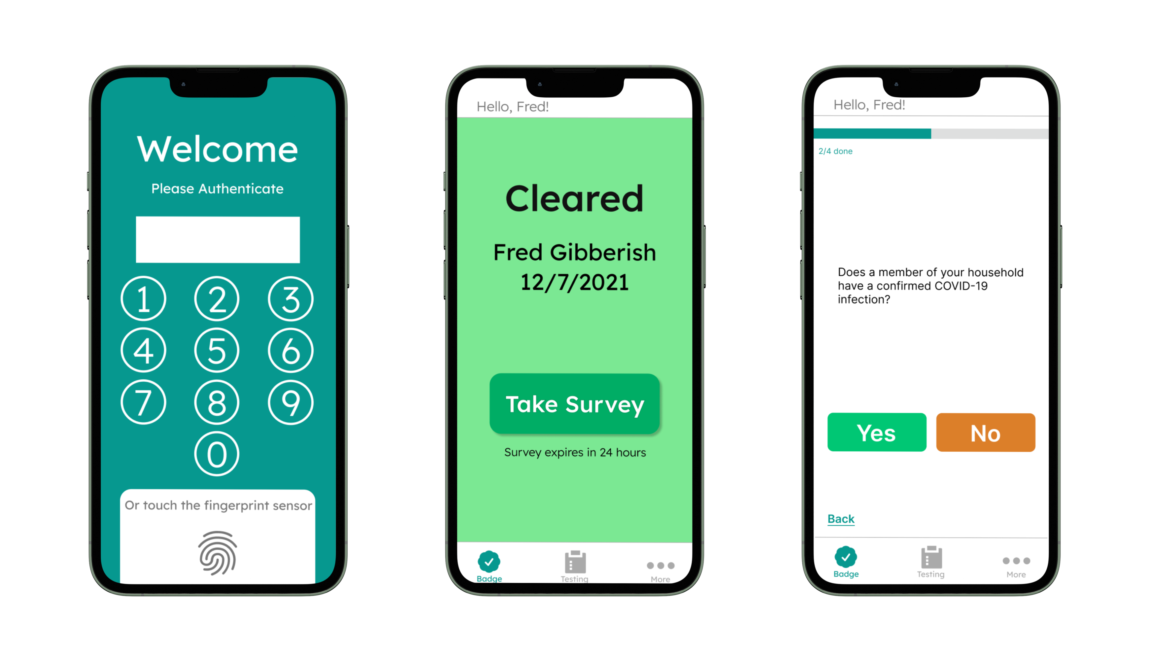

For several years of the pandemic, Ithaca College used daily surveys and colored badges to monitor student health.
Before entering the dining hall, gym, or school event, students would display a green badge on their phones to show their compliance with testing procedures and daily health surveys.
I set out to design a better solution: an intuitive, streamlined health app with daily use in mind.
The system is incredibly clunky.
It's slow, time consuming, and difficult to navigate.
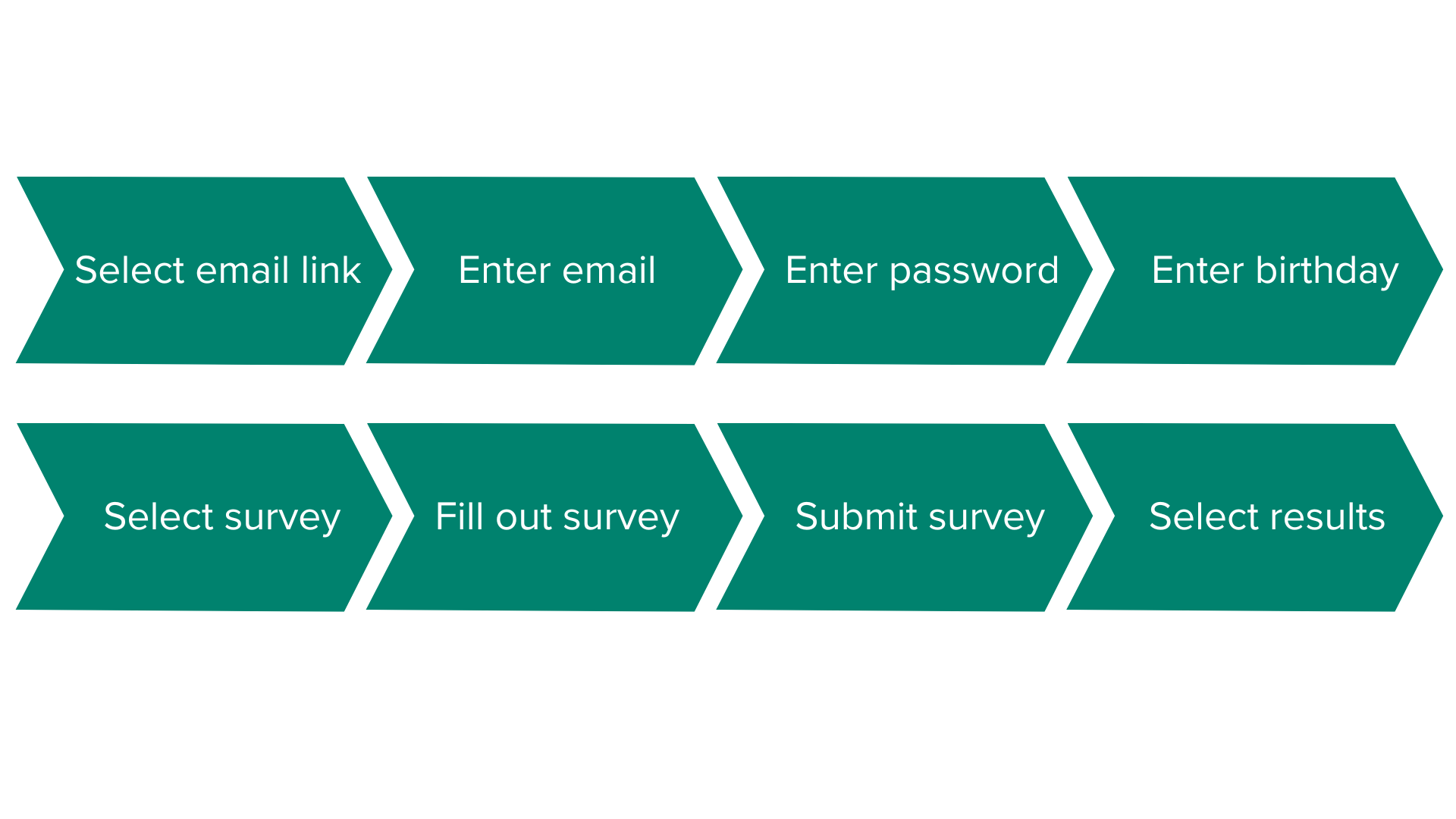
Students follow a link in their emails to the Health Center website where they navigate a dual-factor authentication,
fill out a survey, and eventually access a green badge.
Each time they show their badge, generally 3-5 times a day,
they follow an email link once again to the dual factor authentication to access their badge.
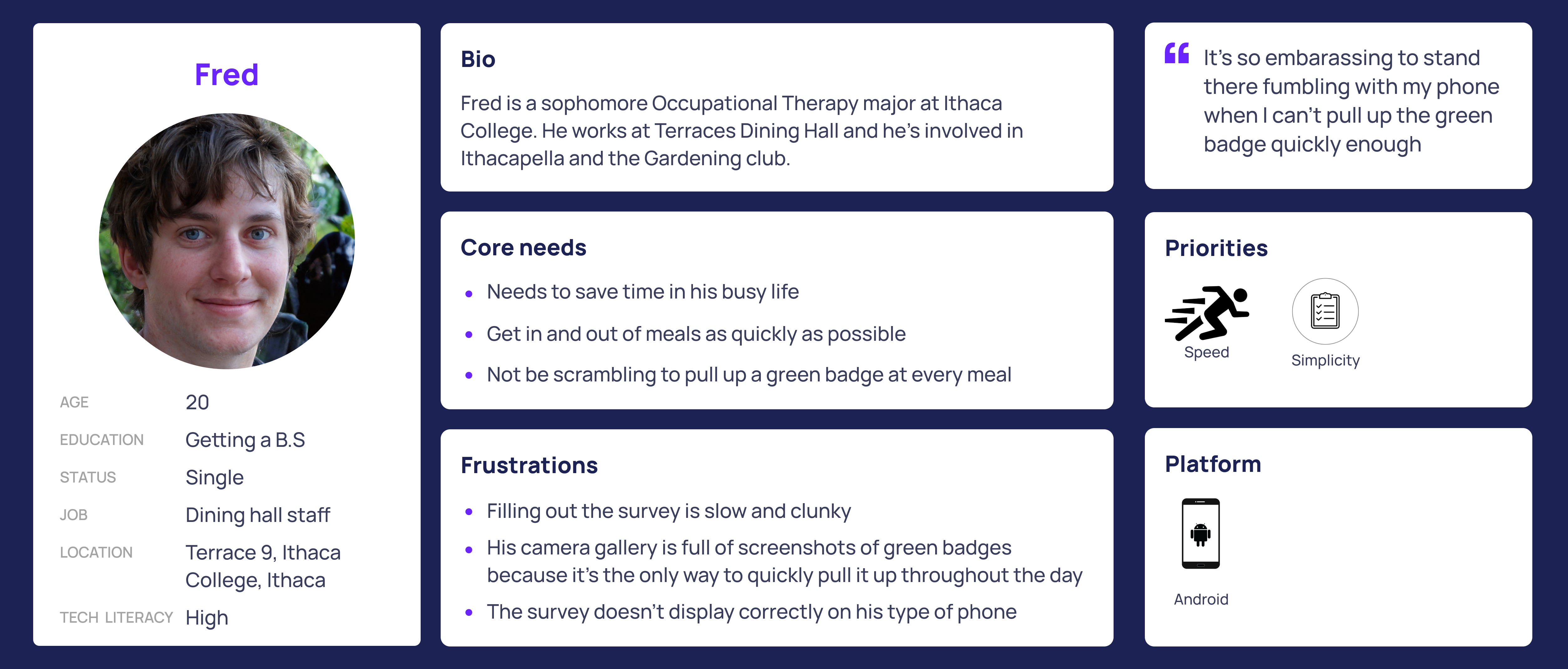
I interviewed five Ithaca College students to glean their frustrations with the health badge system. They overwhelmingly agreed:
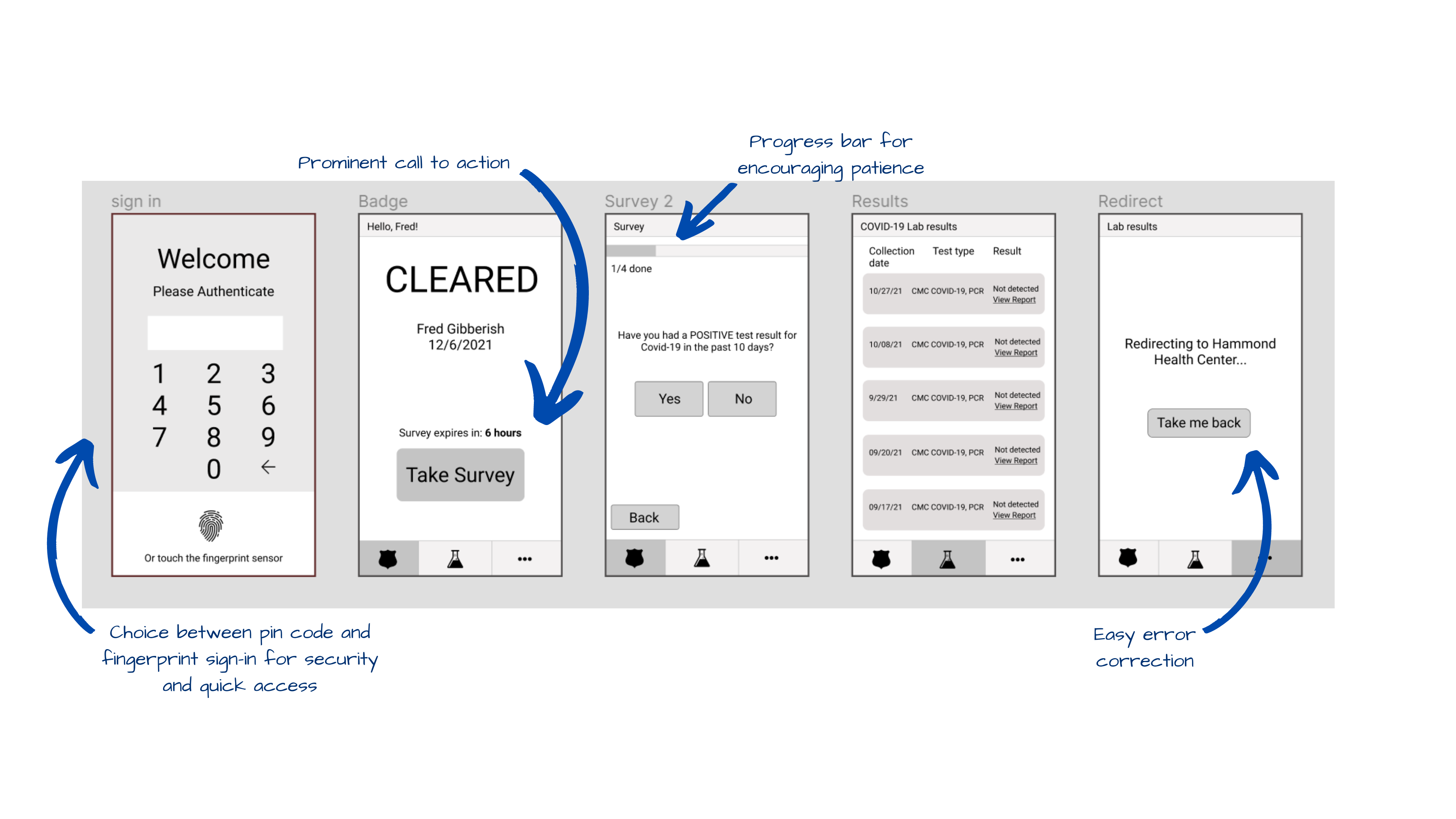
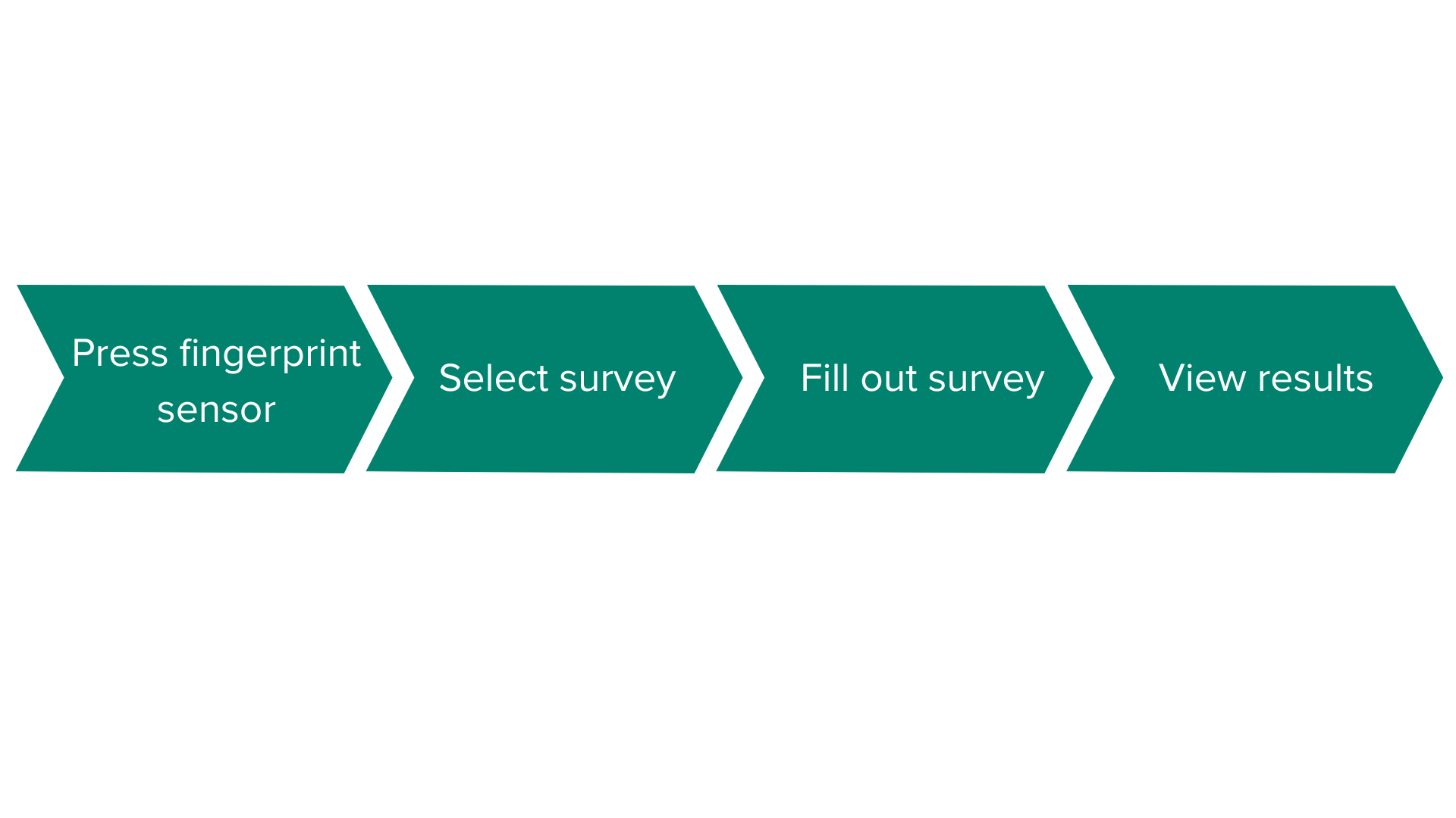
My final designs were focused around speed and simplicity. I reduced the number of clicks in the
flow from twelve to six, drastically improving the rate of completion.
I was constrained in my design by the requirements of a medical app. It would have been
a more streamlined flow if users weren't required to sign in each time they opened the app, but
because of the confidential medical data stored in the app, password protection was a non-negotiable.
I was also unable to alter the contents of the survey. In an ideal world I would have rewritten the survey
to be more clear and concise, but unfortunately that was outside of the scope for this project.
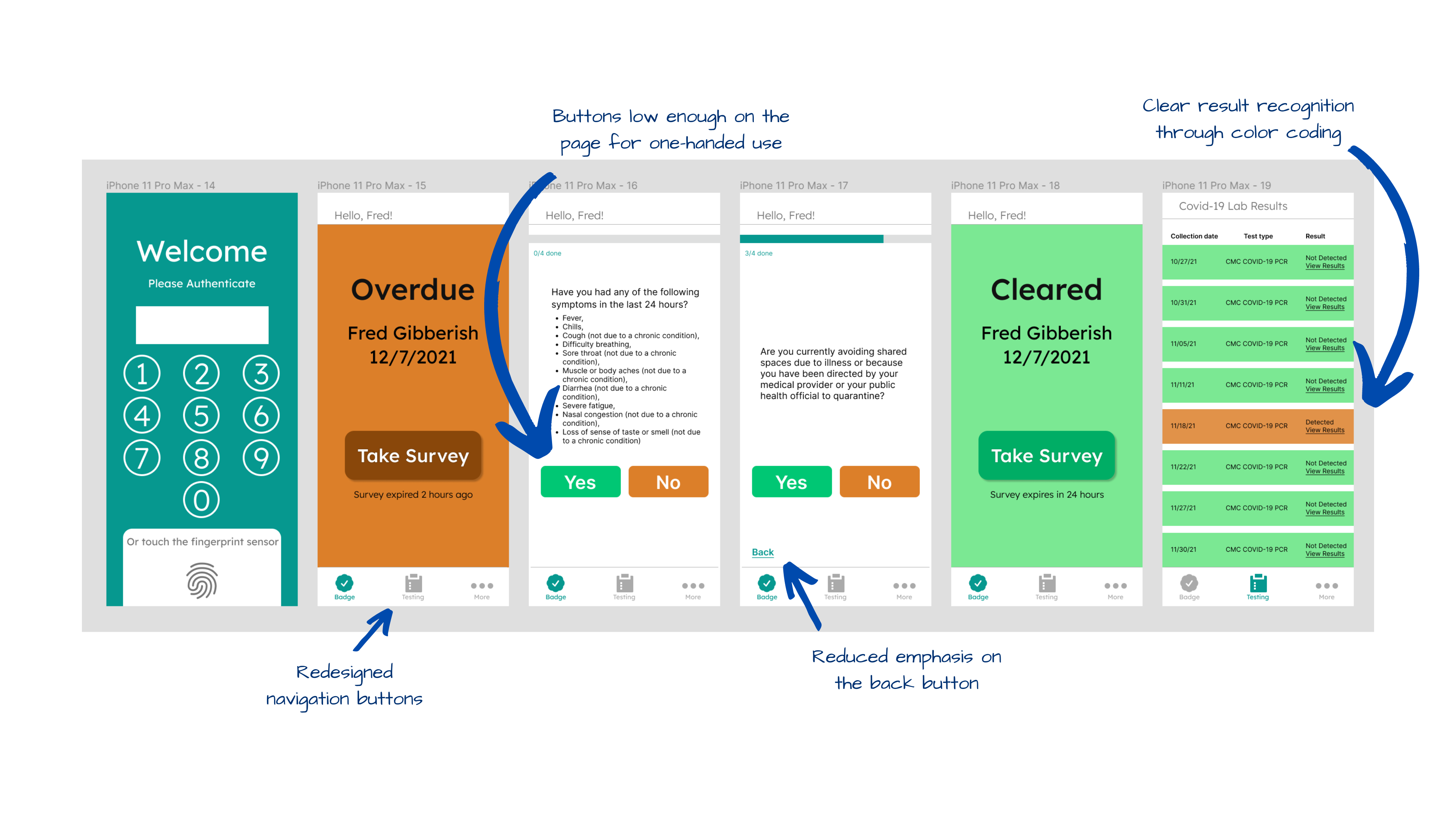
During usability testing, I ran a series of observational walkthroughs with college students who were familiar with the original health tracking system. The goal was to assess the ease of use and reactions to the new design.
Results:
Thanks for stopping by! Let's connect 👋
CONTACT ME 📩
rachelgellman02@gmail.com